Squarespace Event & Calendar Filter
The event calendar Squarespace should have built.
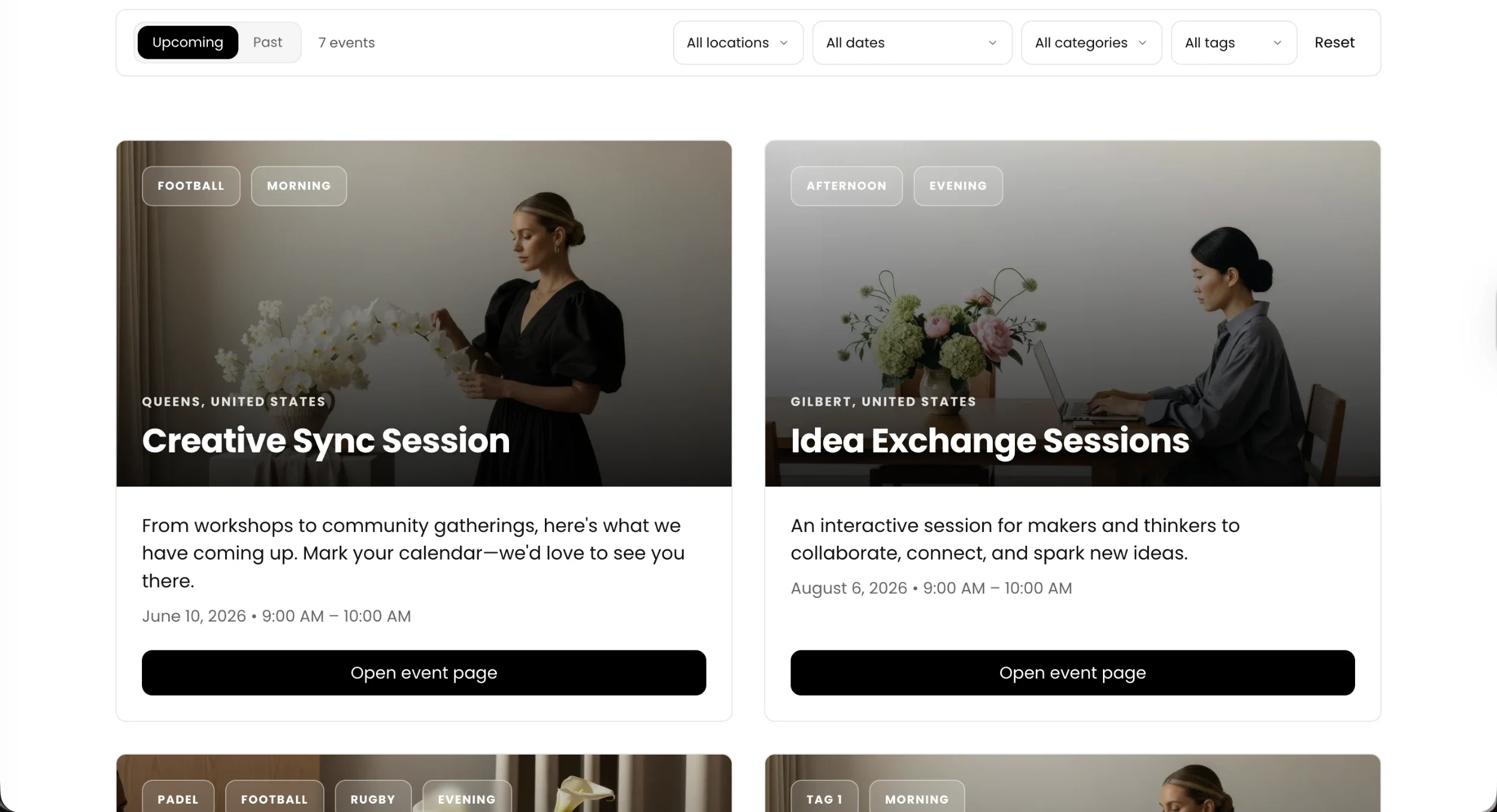
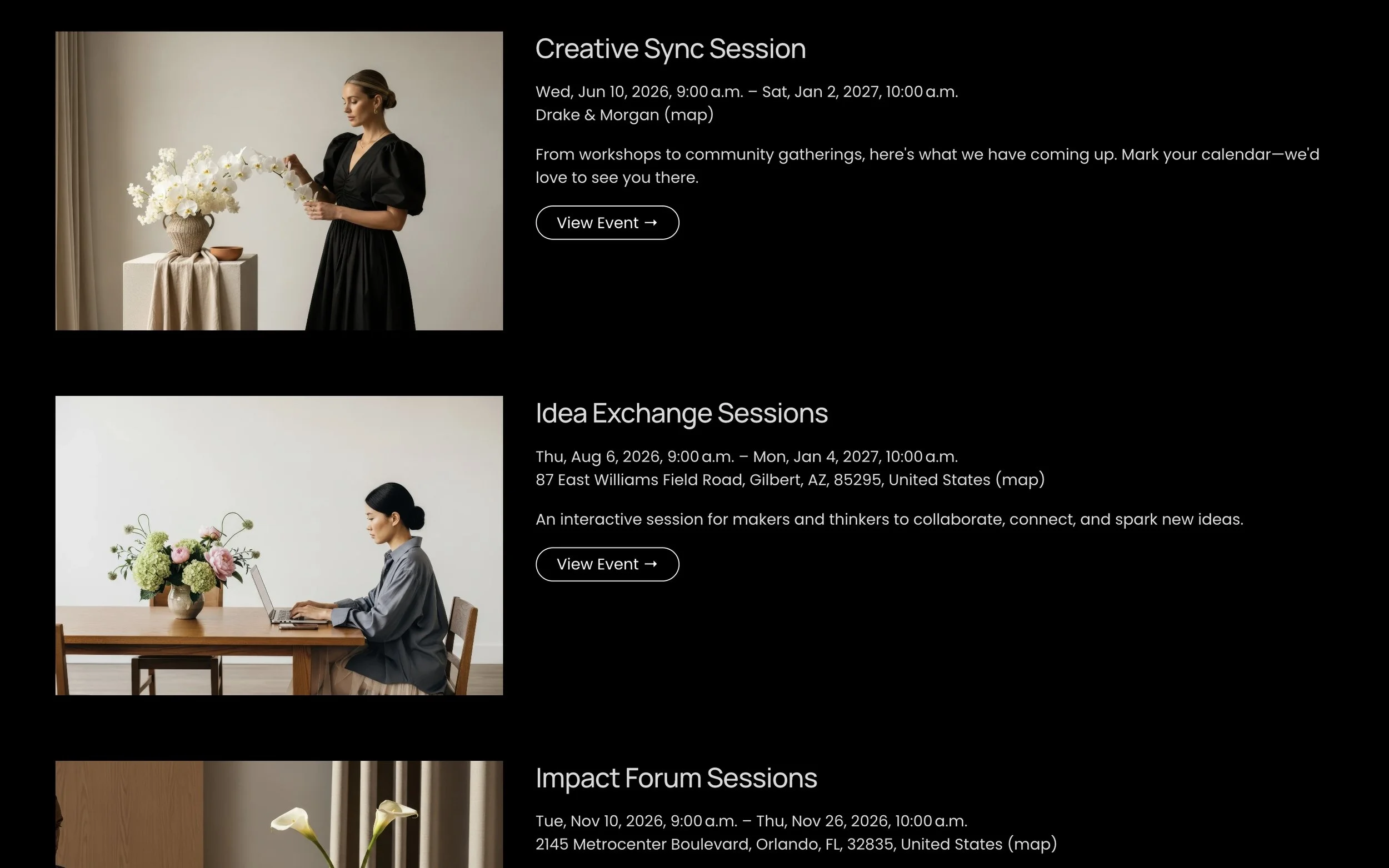
Squarespace gives you a basic event list. Your visitors deserve better. The Event & Calendar Filter transforms your events page into a fully interactive, filterable calendar — without touching a line of CSS.
Visitors filter by date, location, category, and tag. They toggle between upcoming and past events. They find what they're looking for in seconds, not scroll after scroll.
Default View
Updated View
Squarespace Site Styles
The plugin reads your site's design automatically.
Enable native styles and the Event Filter inherits your primary button color, text color, and border radius directly from Squarespace Site Styles — applied across every toggle, dropdown, and action button. Your site's look, zero extra work.
Auto from Site Styles
01 — Design
Shape the layout and visual feel.
01.1
Primary color
Used for active toggle states, date picker selection highlights, and the reset button link. When native Squarespace styles are enabled, this is read automatically from your site's primary button color — no manual entry needed.
01.2
Button border radius
Controls toggle buttons, dropdown headers, and the Apply/Cancel buttons in the date picker. Pill-shaped by default, or pulled from your site's own button radius.
01.3
UI border radius
Applied to event cards, dropdown panels, the date picker, and the filter bar container. Set independently from the button radius for fine-grained control.
01.4
Card layout — columns
1-column timeline list, 2-column grid, or 3-column grid. Collapses to 2 columns on tablet and 1 column on mobile automatically.
01.5
Image overlay darkness
A gradient overlaid on hero images keeps title text legible over photography. Adjustable from 0–100% to suit your imagery.
01.6
Swap badges and date
Default: category/tag badges in the hero image, date in the card body. Swapped: date becomes a frosted glass pill in the hero; badges drop into the card area below.
02 — Filters
Show only what your visitors need.
02.1
Visibility toggles — 9 options
Independently show or hide every element of the filter bar. Turn off what doesn't apply to your event setup.
Upcoming / Past
Event count
Reset button
Location filter
Date filter
Category filter
Tag filter
Category badges
Tag badges
02.2
Custom category order
Filters sort alphabetically by default. Provide a comma-separated list to set the exact order categories appear — ideal for time-of-day, skill level, or priority sequencing. Unlisted items fall to the bottom alphabetically.
02.3
Custom tag order
Same control for tags — define the order they appear in the dropdown. Mix manual ordering with automatic fallback for any unlisted tags.
03 — Date Picker
A calendar that speaks your language.
03.1
Date format
MM/DD/YYYY for US audiences or DD/MM/YYYY for international sites. Affects both the manual input fields and the label shown in the filter bar.
03.2
Preset labels
Today, Tomorrow, This Week, Next Week, This Month, Next Month, This Year, Next Year, All Time, Custom — every preset label is configurable for any language.
03.3
Apply and Cancel labels
The action buttons inside the date picker panel. Set them to match the language of the rest of your site.
04 — Preloader
Polish the moment before events appear.
04.1
Background color
The full-screen loading overlay color. Match it to your site background so the transition is seamless.
04.2
Spinner color
The animated loading indicator. Set independently from the background — a contrasting color keeps it visible.
04.3
Text color
The loading message text color, set independently from the background and spinner.
04.4
Loading message
"Loading All Events..." by default — translate or rewrite to match your brand voice.
05 — Labels & Language
Every word, yours to set.
05.1
Time toggle labels
"Upcoming" and "Past" — the two states of the time toggle. Translate or rephrase freely.
05.2
Event count labels
Singular ("event") and plural ("events") shown next to the live count. Both configurable for any language.
05.3
Filter default labels
"All locations", "All dates", "All categories", "All tags" — the placeholder text shown in each dropdown when nothing is selected.
05.4
Reset and Select All
The master reset button label and the select-all option inside multi-select dropdowns.
05.5
Card button text
"Open event page" by default — the CTA on every event card. Set it to match your voice: View Event, Book Now, Learn More.
05.6
No-results message
The title and subtitle shown when active filters return zero events. Fully configurable, including in translation.